Frankenstein is probably one the most depicted works of fiction from the Western literary canon. Both the name and the main character have become part of the a common lexicon that most people in the world share, it's popular culture. So much so that a lot people don't know that the "monster" and Frankenstein are creator and creature, and not the same character.
When I was tasked with the job of coming up with a cover for it, it made sense to me to steer away from the way it's normally depicted, with the creature almost always as the center of the illustration, so I chose to have the doctor on the (literal) spotlight, having the creature covered in a sheet, while being sowed together.
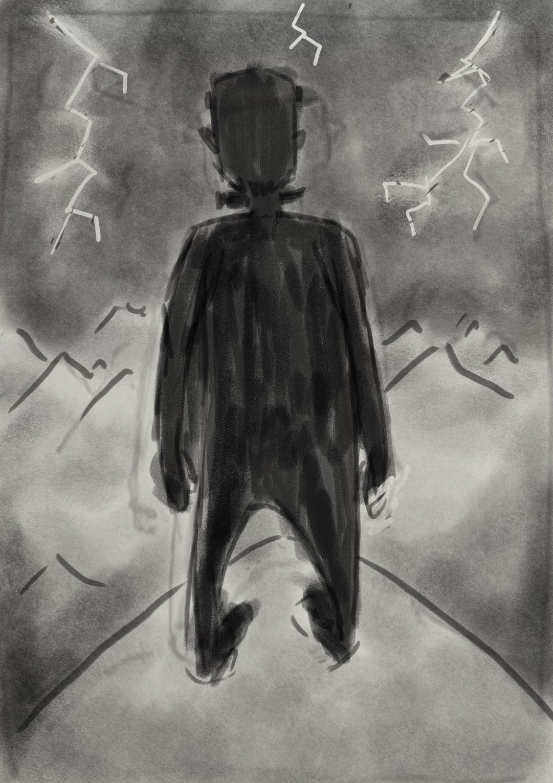
Even though I had a couple of options with the creature during the sketch phase, in the end, the doctor in its lab was chosen.
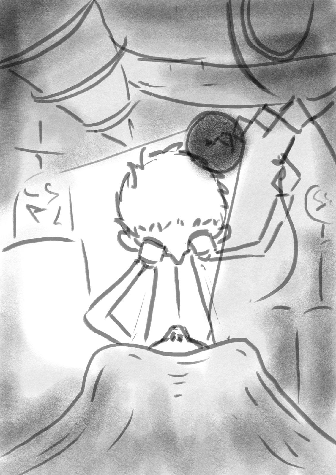
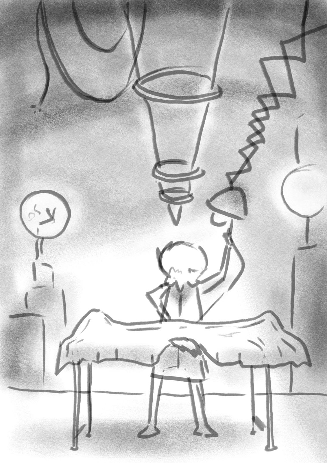
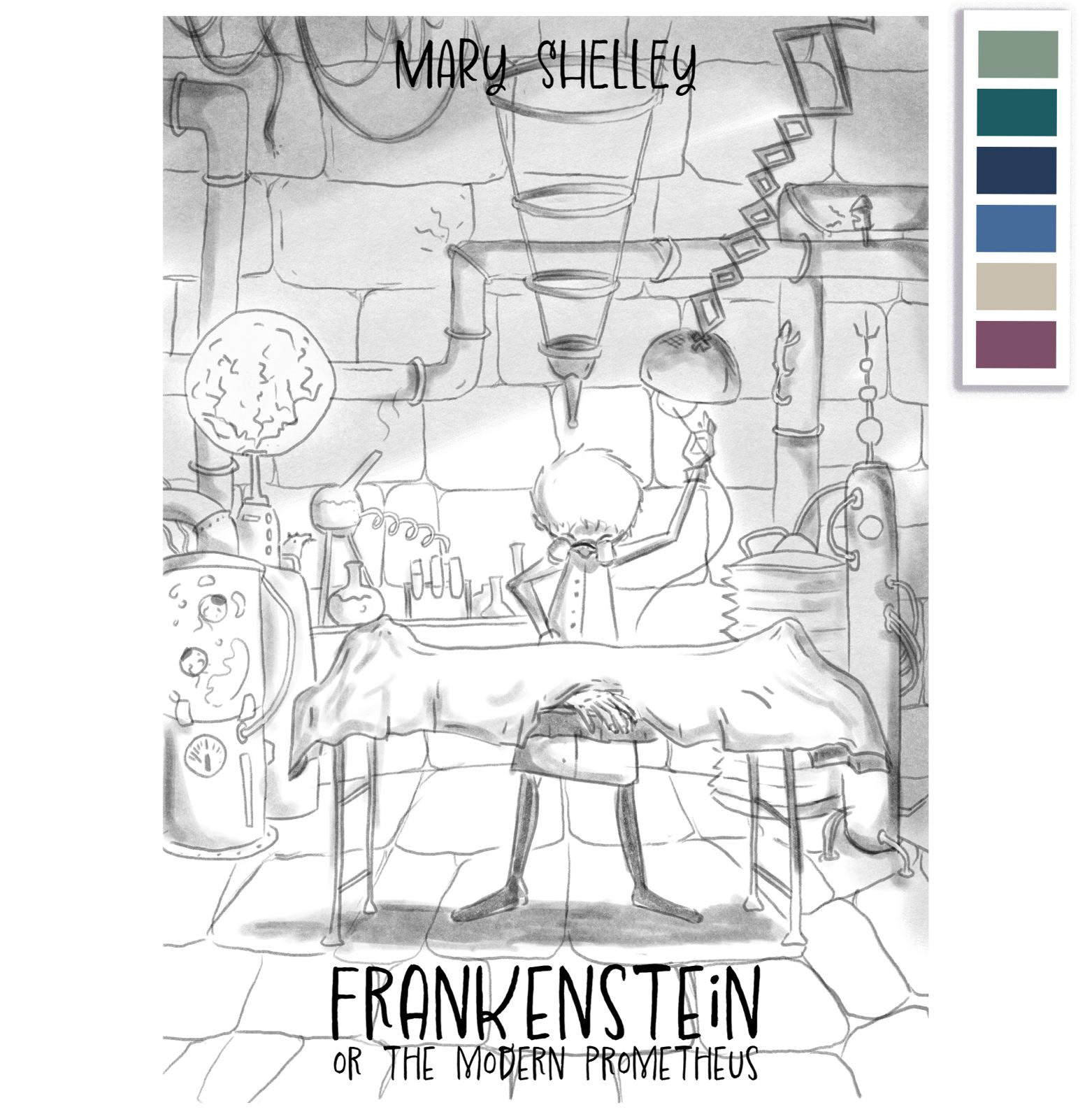
With a mixture of options 2 and 3, I came up with a more detailed sketch, complete with color palette, and lettering placement, to be followed by color value sketches.
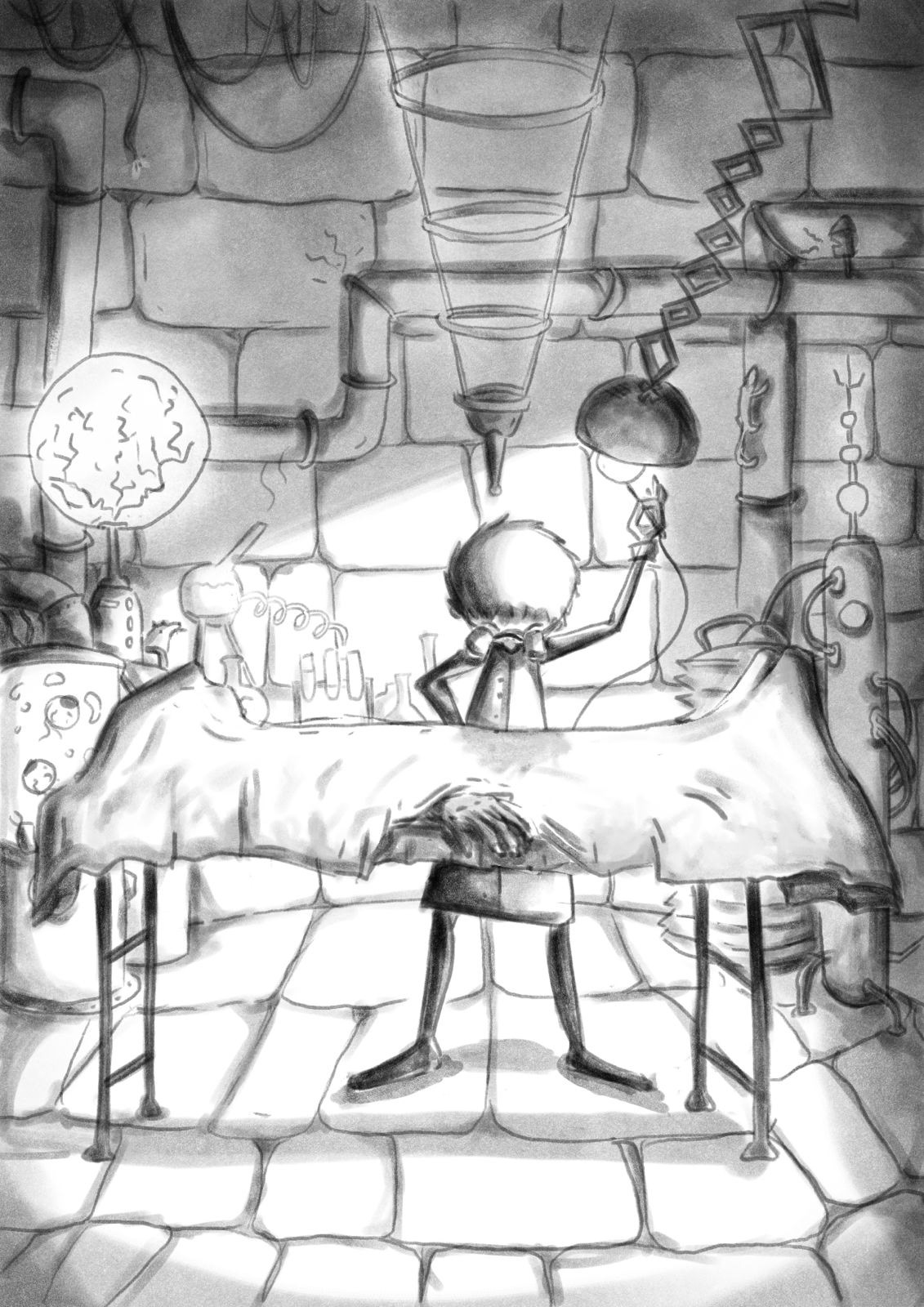
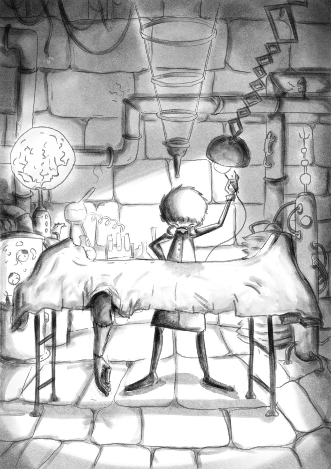
In the coloring process, I found the perspective of the operation table (and thus, of the creature) was a little off. To make sure the arm fell in the correct angle, it was important to add more depth to the table and to the scene. And thus, the illustration was ready:
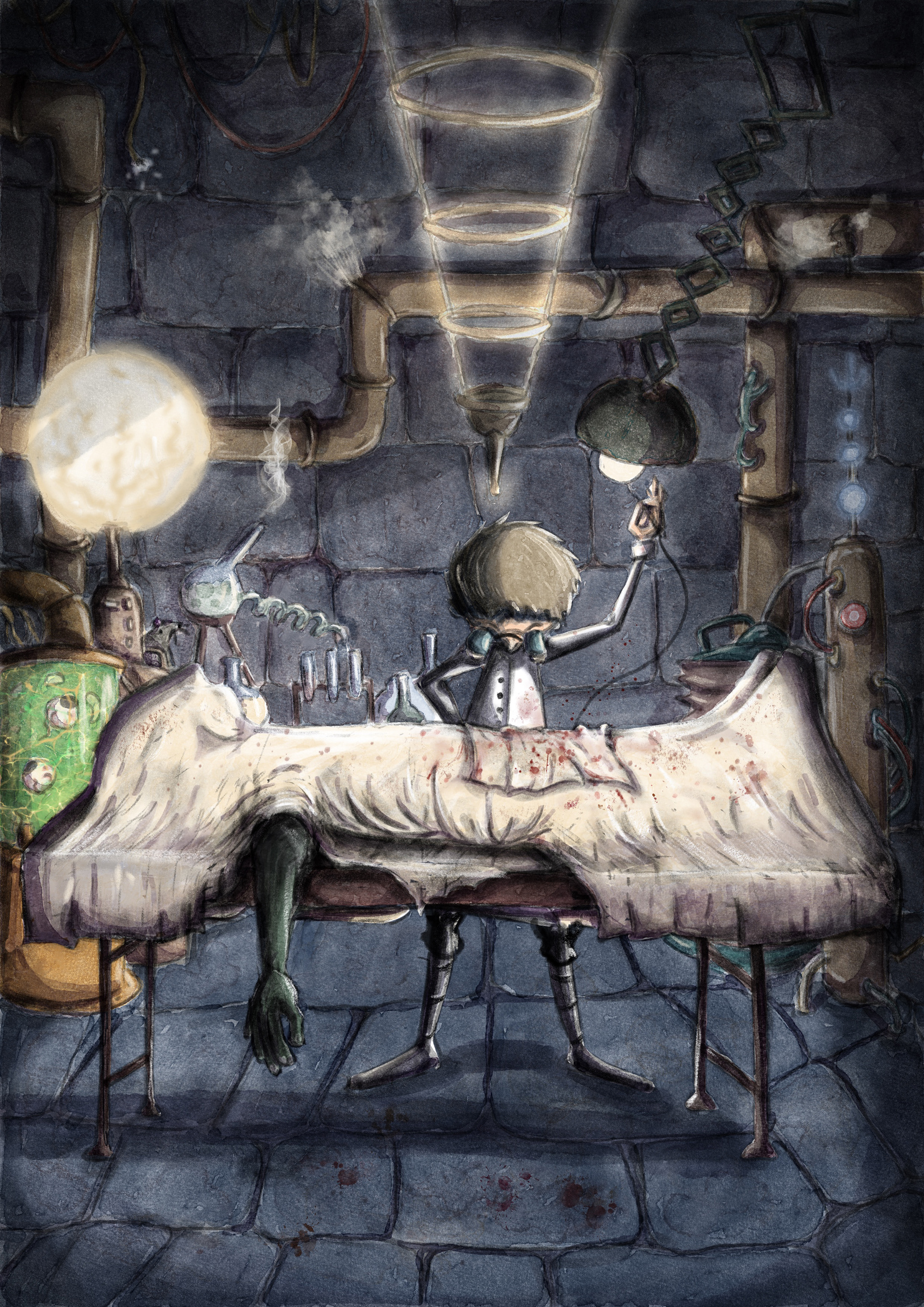
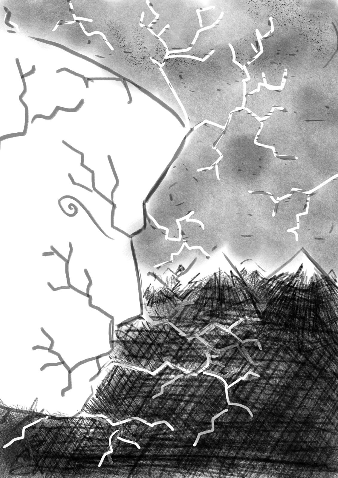
For the back cover, the idea was to make a connection to both the story and the front cover. For that, a detail from the laboratory was chosen, but depicted in shambles, as an aftermath of the monsters awakening.
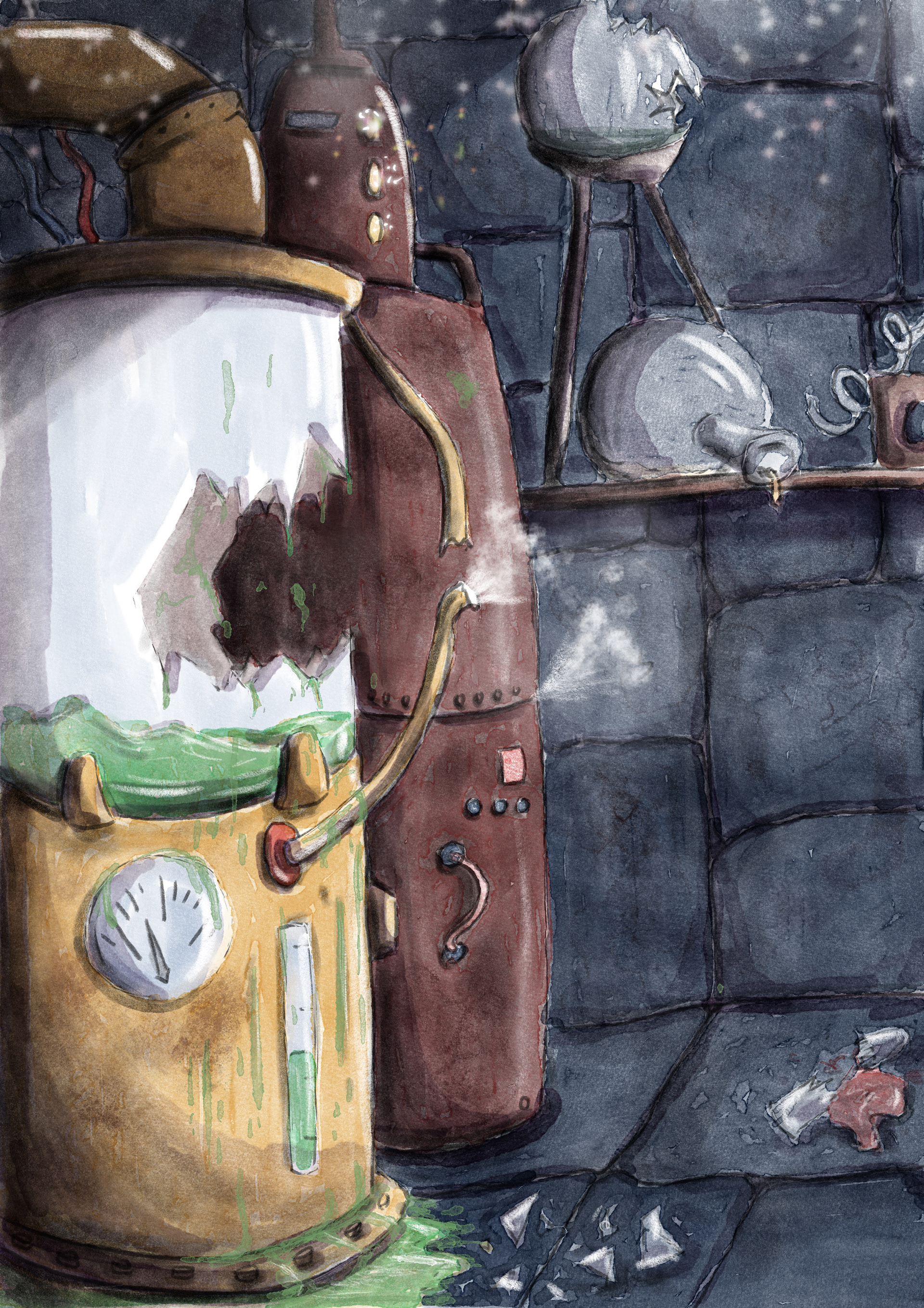
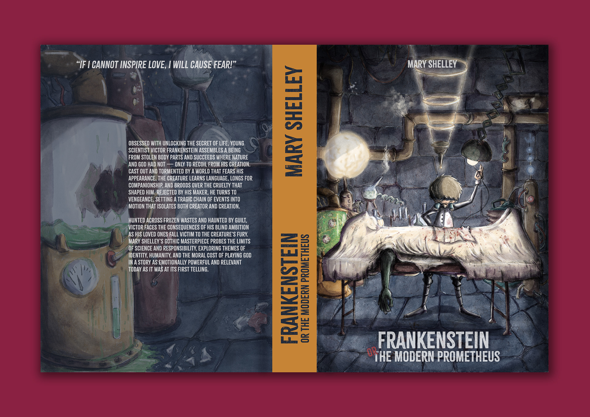
As both illustrations are very detailed, in order to not clutter the covers, I chose a blocked and sans serif font. With that in mind, and trying to make it stand out on a shelf, the book spine was designed in a solid color, with the same font.
Thanks for watching! :)
If you like what you see, you can follow me on Instagram.
If you like what you see, you can follow me on Instagram.